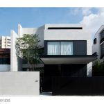
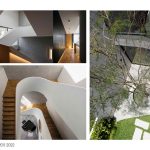
Chord House is situated in a small housing estate in central Singapore. The house sits on a sloping road which has a public bus route running along it, with a bus stop located two houses away. The road is the main exit point for the estate, so the traffic passing by tends to be heavier than normal. As such, privacy from vehicle and pedestrian traffic was a big factor in our design for the house.
Architecture, Construction & Design Awards 2022
Second Award | Private Residence (Large) (Built)

| Project Details | |
| Project Name: | Chord House |
| Project Category: | Private Residence (Large) |
| Studio Name: | Ming Architects |
| Design Team: | Tan Cher Ming, Erica Chan |
| Area: | 620 sqm |
| Year: | 2021 |
| Location: | Singapore |
| Consultants: | JS Tan Consultants, CST Consultants |
| Photography Credits: | Studio Periphery |
©Studio Periphery
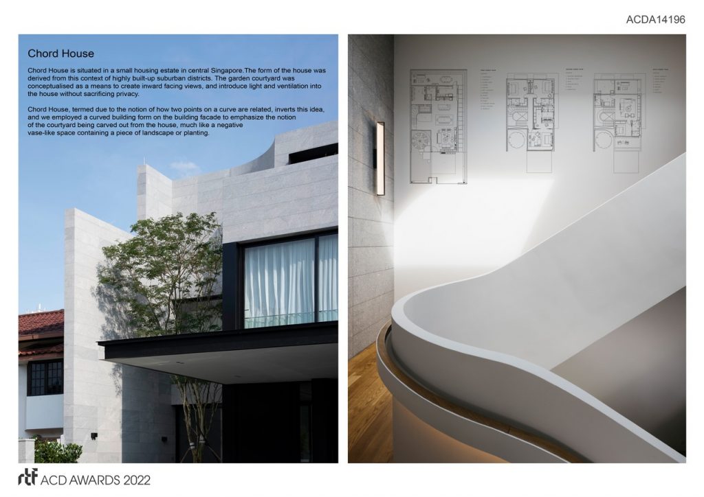
The form of the house was derived from this context of highly built-up suburban districts. The garden courtyard was conceptualised as a means to create inward facing views, and introduce light and ventilation into the house without sacrificing privacy.
As a semi-detached house, the party wall provided an opportunity to create an inward-facing courtyard for privacy. The typical Singapore house has fenestration which faces outwards to the surrounding neighbours and street.
©Studio Periphery
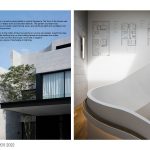
Chord House, termed due to the notion of how two points on a curve are related, inverts this idea, and we employed a curved building form on the building facade to emphasize the notion of the courtyard being carved out from the house, much like a negative vase-like space containing a piece of landscape or planting.
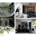
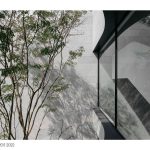
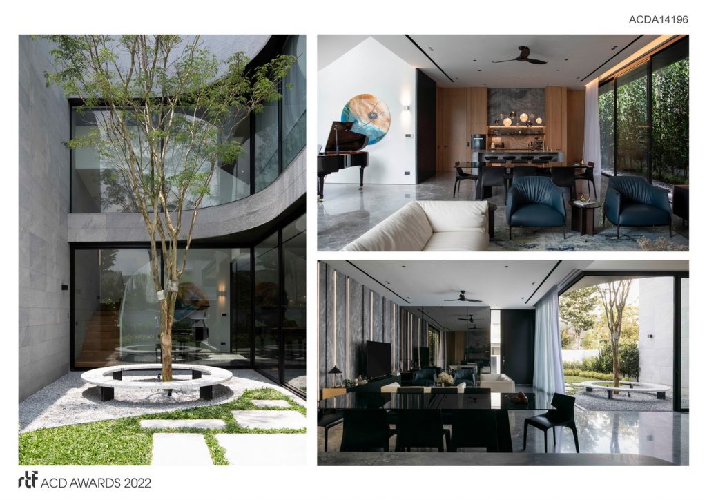
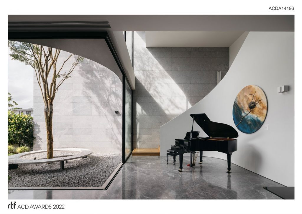
A seven-metre high Caesalpinia tree was specially sourced from overseas so that its foliage would be clearly visible from the master bedroom on the second storey and when traversing the staircase between all three floors.
©Studio Periphery
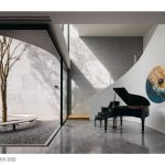
The courtyard is designed to pull in nature deep into the building plan. On the first storey, natural ventilation and light floods the living and dining spaces when the oversized glass doors are opened. The garden feels almost a part of the living, which was important as we did not want the courtyard to feel disconnected from the interiors. The morning sun casts shifting shadows of the tree branches onto the staircase wall, which is clad in light toned granite stone continuing from the exterior, seamlessly into the house.
It was important for us to introduce light and landscape views not only into the living spaces but also the circulation areas, to enable the homeowner to experience the courtyard in a deeper, more seamless way.
- ©Studio Periphery
- ©Studio Periphery
- ©Studio Periphery
