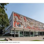
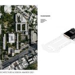
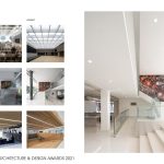
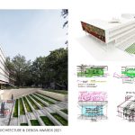
The Rectoría at Monterrey Tec’s primary campus in Monterrey, Mexico, serves as the central administration building for the entire system of campuses around Mexico. The building is the most iconic on the campus and one of the most important in the history of modern architecture in Mexico. Since its construction, its use has changed many times. It was initially used as the central library.
Global Design & Architecture Design Awards 2021
First Award | Category: Institutional (Built)
| Project Details | |
| Project Name: | Transparente |
| Project Category: | Institutional |
| Studio Name: | FGP ATELIER |
| Design Team: | Danilo Medina, Matthew Stymiest |
| Area: | 6700m2 |
| Year: | 2019 |
| Location: | Monterrey, Mexico |
| Consultants: | Lighting, MEP, Acoustics, Façade: ARUP North America (Ryan Biziorek) |
| Landscape: Harari Landscape Architecture (Claudia Harari) | |
| Associate Architect: ODA (Rodrigo Maisterrena, Carlos Estrada Zubia) | |
| Wind: RWDI | |
| Civil Engineer: Arnold Pacheco Garcia | |
| Photography Credits: | The Raws, Francisco Alvarez (http://www.theraws.mx/en/home/) |
| Text Credits: | Francisco Gonzalez Pulido |
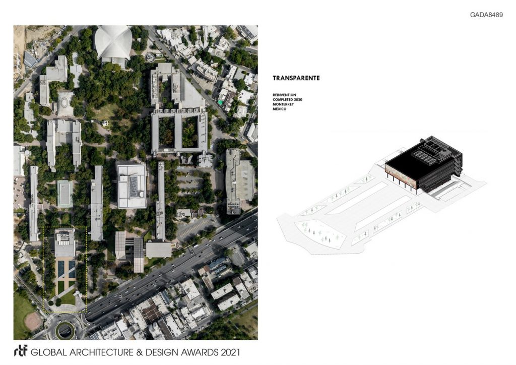
©The Raws, Francisco Alvarez (http://www.theraws.mx/en/home/)
The building is defined by a mural by González Camarena that represents the battle between innovation and lack of purpose. Science is represented in the upper register, while the snakes and dark warriors occupying the lower register represent dark forces that will be conquered by innovation and technology.
The program of the building includes a rare book collection known as the Cervantina, which houses the world’s largest collection of works by Cervantes as well as some of the earliest correspondence between Columbus and Queen Isabella of Spain regarding the discovery of the New World.
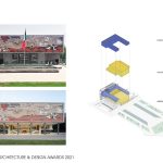
With a building such as the Rectoría, it is important to treat it as an archeological project. The initial sketches were an attempt to 1) create a hierarchy of the myriad parts, 2) identify the client’s goals, and 3) establish guiding principles for the design. This holistic approach was initially something of a surprise to the client, however, as they had imagined simply enhancing each floor. Such an approach would create a solution driven by interior design rather than an understanding of the building’s architecture. It would lack cohesion. Our approach would use architecture to create a feeling of transparency, openness, and democracy. In this context, the leadership of the university supported our initiative to proceed with a significant improvement while retaining its historical character.
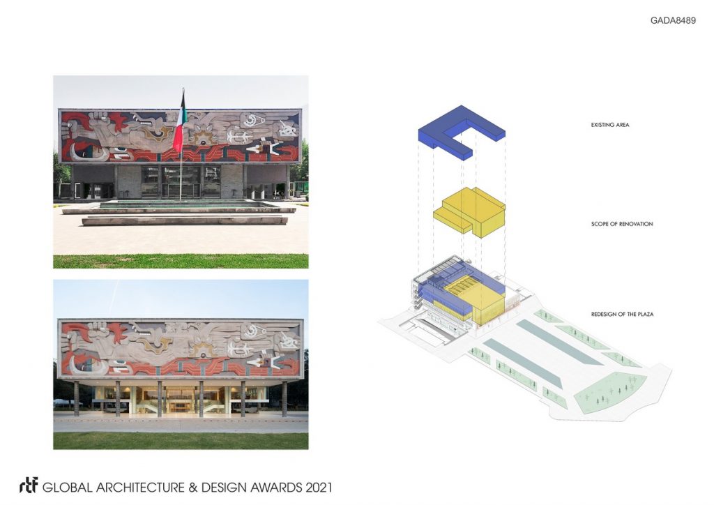
©The Raws, Francisco Alvarez (http://www.theraws.mx/en/home/)
In approaching the renovation, there was a lot of concern about doing an intervention in an iconic building. The building needed to be treated as a whole. The initial inspiration was driven by the
theme of innovation in the mural. The project would follow this lead of openness and be about reimagining great spaces, creating clear circulation, fostering democratic space, and transforming a mysterious and hermetic building into something extroverted and open.
The transformation of the building would be accomplished through the application of a few great ideas:
1) creation of grand spaces in synchronicity with the scale and importance of the building
2) creation of a clear and legible circulation concept
3) recovery of the original spatial relationship between the access plaza and the building
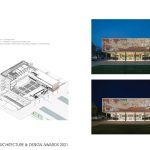
4) respecting the past through a thoughtful and minimal intervention paying special attention to materials and systems
5) focusing on functionality to accommodate change and provoke seamless flows among all spaces
6) striking a balance between preservation of the building’s special character, quality, and historical significance and facilitating change in a way that sustains it into the future
7) ensuring that the new layers represent the ideas, technology, material, and architectural language of future generation;
8) focusing on the quality of the relationship between old and new, and not in the architectural language per se;
9) designing quality in the new Rectoría defined by scale, form, material, color, and detail; and
10) ensuring that the Rectoría reflects the new spirit of Monterrey Tec.
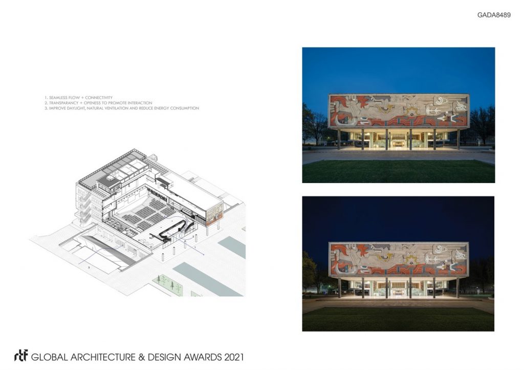
©The Raws, Francisco Alvarez (http://www.theraws.mx/en/home/)
A building that has one or two strongly executed ideas will always be better than one with many. In this sense, the strategy was not about being minimalist, but about removing what was superfluous and getting to the essence. At the same time, functionality was important. The building had to outlive many generations and live into the future.
- ©The Raws, Francisco Alvarez (http://www.theraws.mx/en/home/)
- ©The Raws, Francisco Alvarez (http://www.theraws.mx/en/home/)
- ©The Raws, Francisco Alvarez (http://www.theraws.mx/en/home/)
