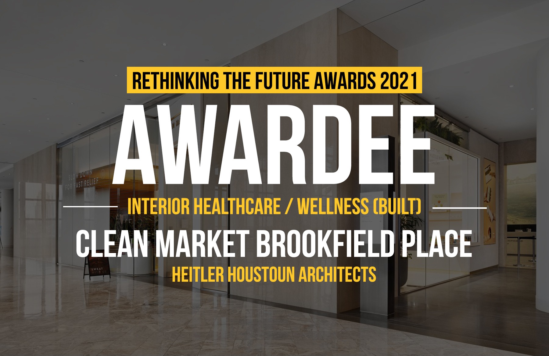
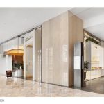
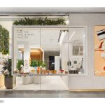
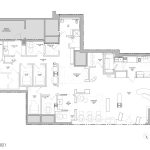
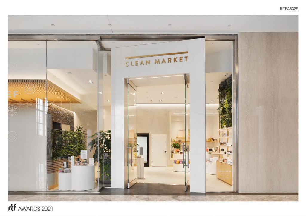
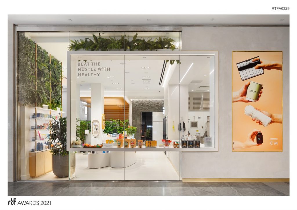
The project consists of a new, Clean Market location in Lower Manhattan’s Brookfield Place. The crux of the design challenge was to create an elevated yet approachable wellness destination within a bustling luxury mall and conduit to the world financial center. The fast-paced commercial corridor could be seen as a challenge to a space intended for relaxation, replenishment and self-care. However, the site was also uniquely suited to our biophilic approach to the project’s design. Located in a corner suite on the second floor, Clean Market is perched over the Winter Garden atrium – a destination in and of itself overlooking the Hudson River. Our design of the extensive storefront emphasizes this connection by shifting the main entry off the Mall’s grid to angle itself toward the river views and natural light. The key to designing for this location was to utilize the mall’s attributes and reinforce that Clean Market is different. This is not a retail-as-usual environment.
Rethinking The Future Awards 2021
Second Award | Healthcare & Wellness (Interior) (Built)
| Project Details | |
| Project Name: | Clean Market Brookfield Place |
| Studio Name: | HEITLER HOUSTOUN ARCHITECTS |
| Design Team: | Principal|Josh Heitler, AIA, LEED AP |
| Project Manager| Kimberly M. Coca, AIA | |
| Architectural Designer|Edgardo Cadiz | |
| Interior Designer|Carol Zhang | |
| MEP engineer| EP Engineering LLC | |
| GC| Michilli inc. | |
| Area: | 2,700 SF |
| Year: | 2020 |
| Location: | Clean Market Brookfield Place, 200 VESEY ST, 2ND FLOOR #215, New York 10281 US |
| Consultants: | Lighting Consultant|RL Studio |
| Landscape Architect| Blue Dahlia Landscape Design | |
| Horticulture Kitchen Vendor|M. Tucker | |
| Storefront| Metal Vetro SRL | |
| Photography Credits: | Joel Pitra from DDReps |
| Other Credits: | Stonewall cladding (interior) is “mountain bluestone panel stacked stone” from MSI stone; plaster coating is “claystone” from ernestny. |
©Joel Pitra from DDReps
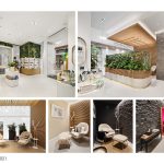
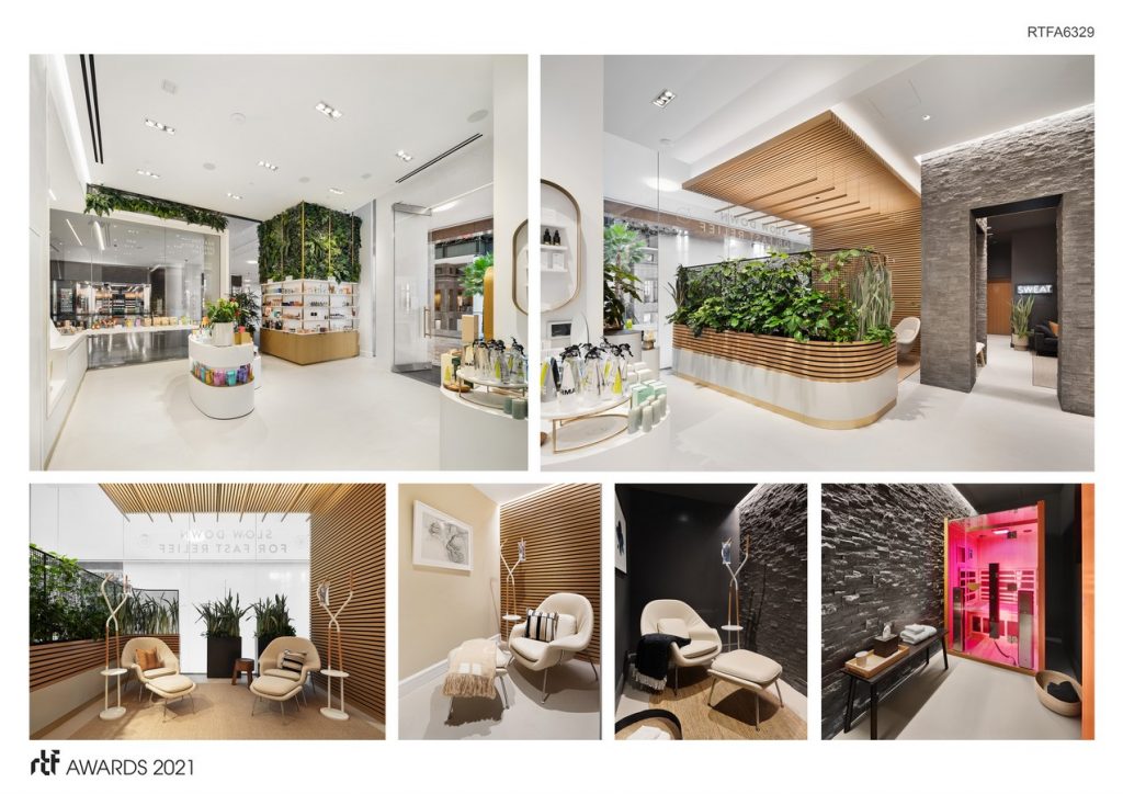
Once inside, Clean Market is refreshing, bright and optimistic but also lush and unexpected. A corner retail display is punctuated with a green wall that extends to the full ceiling height. The floating displays are tiered and curved creating a soft, meandering path through the curated products.
While a vast, bright space is perfect for the tonic bar and modern apothecary, it’s in natural opposition to the desired feel for the Nutridrip Lounge. That space, where IV vitamin drips are administered, wants to feel private and quiet, but also hidden. While we wanted to ensure natural light was maximized by positioning the lounge at the storefront, privacy was created with a custom frosted graphic that fades into clear glass above eye level so there is only a faint suggestion of activity. A custom slatted maple wall turns overhead which creates a separate sense of place from the retail just a few feet away. A curved custom planter creates a living, breathing, partition giving the space a private, secret garden feel. Within the lounge, clients sit in womb chairs and the IV drip bags hang from our custom-designed drip ‘trees’ made of powder-coated steel and oak.
©Joel Pitra from DDReps
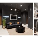
Next to the wood ceiling that defines the Nutridrip Lounge is a bluestone volume which announces the Thermostat brand. Through its threshold, two neon signs boldly present its offer to “sweat” or “chill.” The Thermostat lounge allows a quick respite in between, should you choose to take advantage of both the full-body cryotherapy chamber and one of several private infrared sauna rooms.
©Joel Pitra from DDReps
Before even entering the space, Clean Market distinguishes itself with its custom-tailored storefront design. Once you pass thru its threshold, Clean Market retail, the Nutridrip lounge and Thermostat each project a clearly defined, yet complimentary aesthetic. The design of the space emphasizes the unique features of the mall but also brings each visitor into a completely unexpected place. The space transports you from the hustle and bustle of the city, into a serene oasis bringing the customer closer to nature and to self.
- ©Joel Pitra from DDReps
- ©Joel Pitra from DDReps
- ©Joel Pitra from DDReps
