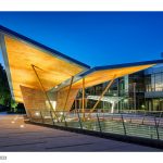
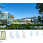
Developing land equates to reconfiguring its role in the setting it is part of. Routinely it entails an increase in buildable area to maximize return on investment. In Silicon Valley this rings particularly true since its economy is magnetic for the global entrepreneurial appetite. The Lockheed project, instead, is structured around an alternative approach and therefore stands out from its surroundings: the actual area is unaltered from the existing. It is sited the same way as what is already there. What does change is its efficiency as a building.
Rethinking The Future Awards 2023
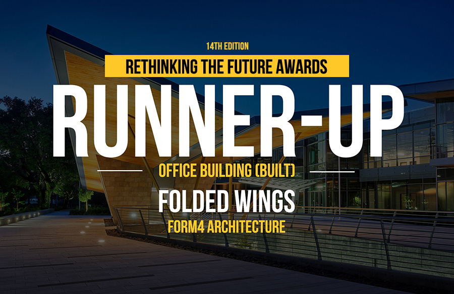
Third Award | Office building (Built)
| Project Details | |
| Project Name: | Folded Wings |
| Studio Name: | Form4 Architecture |
| Design Team: | John Marx, AIA, Chief Artistic Officer, Project Designer, James Tefend, Principal-in-charge |
| Area: | 185,800 sf. |
| Year: | 2021 |
| Location: | Palo Alto, CA |
| Consultants: | Landscape Architect: Studio Five Design |
| Civil Engineer: BKF civil | |
| MEP: M-E engineers | |
| Structural Engineer: DCI | |
| Construction: Truebeck Construction | |
| Photography Credits: | Photos by John Sutton Photography |
©Photos by John Sutton Photography
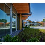
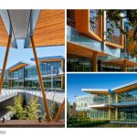
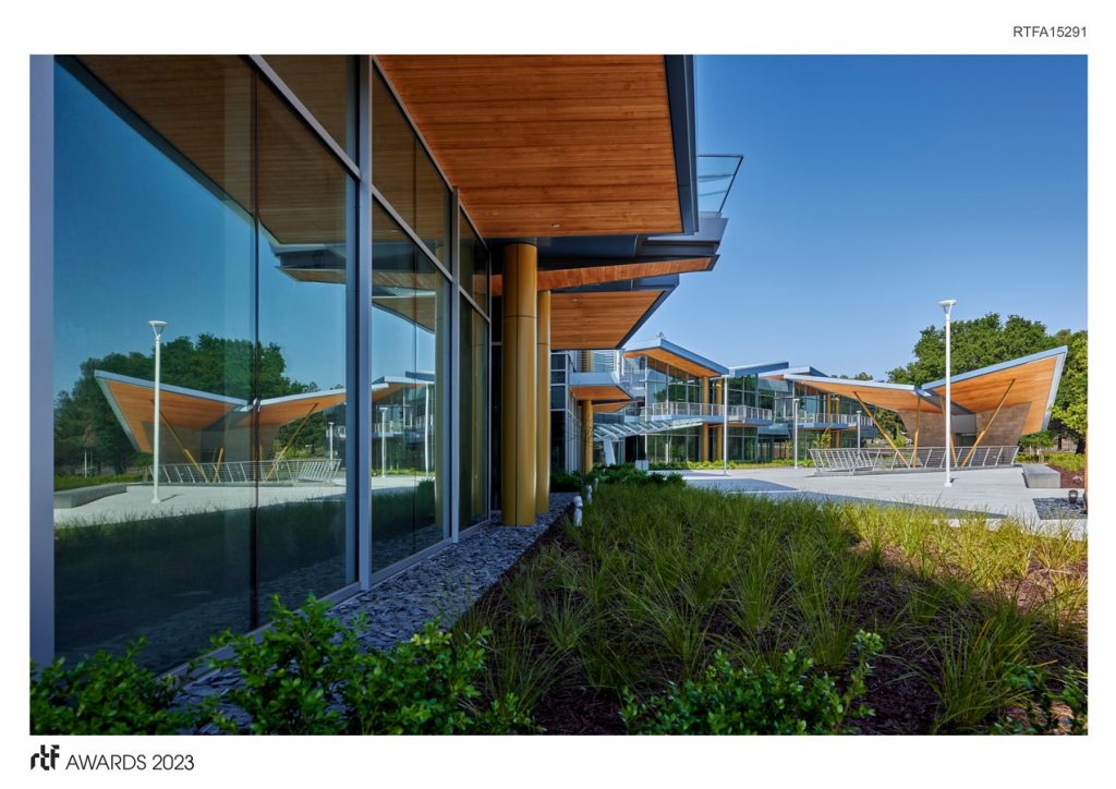
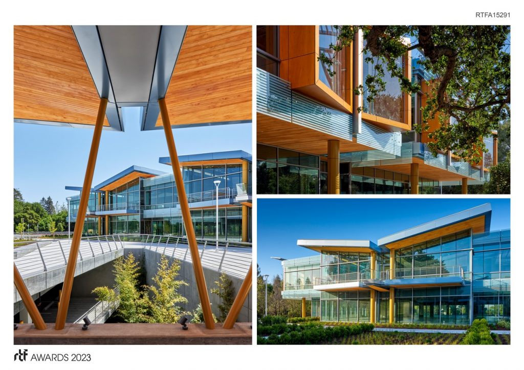
The first consequential decision in the architecture was to angle the typical office bar at mid-point of its footprint to outline an urban plaza porous to pedestrian circulation. This proposition leaves the optimization of the core and shell plan for workspace unchallenged but delivers a tangible reward in the quality of the public space generated. The angles used to bend the building and its proportion and to define the butterfly section are entirely intuitive. The parti in plan follows existing good practices in workplace planning, while at its edges, a controlled articulation of in-and-outs significantly confers visual interest thanks to the hypnotic interplay of light and shadow as sun rays hit the exterior surfaces. This two-story structure cantilevers those cut outs on the upper flooring, essentially becoming canopies shielding direct light to the floors below.
©Photos by John Sutton Photography
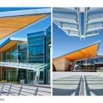
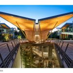
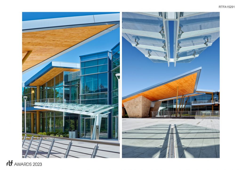
A free-standing structure with a canted canopy signals access to the two levels of parking below grade. Upon arrival from the parking garage, visitors encounter a butterfly theme embodied in a folded roof and a folded facade: folding is the leitmotif of this project. The multiplication of those roofs breaks the scale of the anonymous office bar into visually comprehensible units that when knitted together add richness and texture to the massing. The symmetrical angling of two planes around an axis applied to the facade demonstrates that its repeated application yields architectural unity rather than a chaotic jumble of discrete design episodes.
©Photos by John Sutton Photography
Although this is a speculative office building for technology companies and one tenant only, its overall appearance yields a form of humane modernism at the scale of the pedestrian. The recesses add texture and interest all around the building exterior, exhibiting only minor variations despite the different orientations. The numerous overhangs at the first floor and the recesses on the second floor, and cost-effective solar control, allow for a significant amount of glass to be used while still making this a LEED Certified building. Echoing the butterfly canopy that signals the access to the garage and the other portals scattered in the landscape connecting the ground planes to the floors below, a very high-tech version of the butterfly marquee featuring fritted glass, specialized fittings, and a canted column mark the main entrance to the building. This compelling object of refined construction ushers the visitor to the experience of a most elegant glass box.
- ©Photos by John Sutton Photography
- ©Photos by John Sutton Photography
- ©Photos by John Sutton Photography
