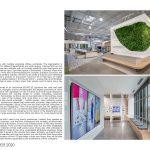
Crocs is a global company with multiple corporate offices worldwide. The organization is complex and the demands for different departments are wide-ranging. Coming from an out- of-the-way, cramped business park address with not enough space for both employees and shoes, Crocs asked us to craft an open, light-filled space in Broomfield, Colorado where their creative teams could thrive while also accommodating the complex business functions and privacy needed in such a competitive industry.
Architecture, Construction & Design Awards 2020
Second Award | Interiors Workplace (Built)

| Project Details | |
| Project Name: | Crocs |
| Studio Name: | Venture Architecture |
| Design Team: | Venture Architecture |
| Area: | 88,000 square feet / 8,175 square meters |
| Year: | April 2020 |
| Location: | Broomfield, Colorado, USA |
| Consultants: | JLL: Project Manager |
| i2 Construction: General Contractor) | |
| 360 Engineering Inc.: Mechanical and Plumbing Engineer | |
| AE Design Inc.: Electrical Engineer | |
| Apex Engineers Inc.: Structural Engineer | |
| Photography Credits: | Caleb Tkach |
©Caleb Tkach
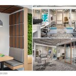
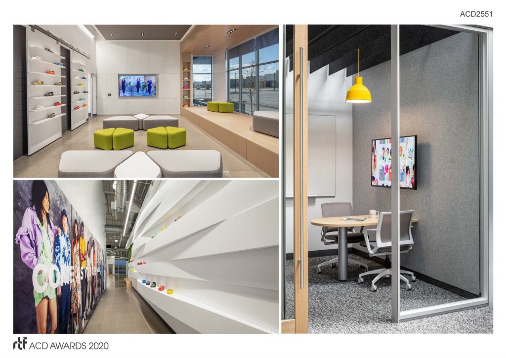
We set out to create a dynamic and interesting space that kept the company’s product on everyone’s mind but not in their laps, no matter where they were seated. We started calling it ‘A Home for Work’ – a place that is comfortable, casual, and makes people feel at ease. A place where their people want to come every day and do their best work.
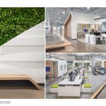
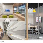
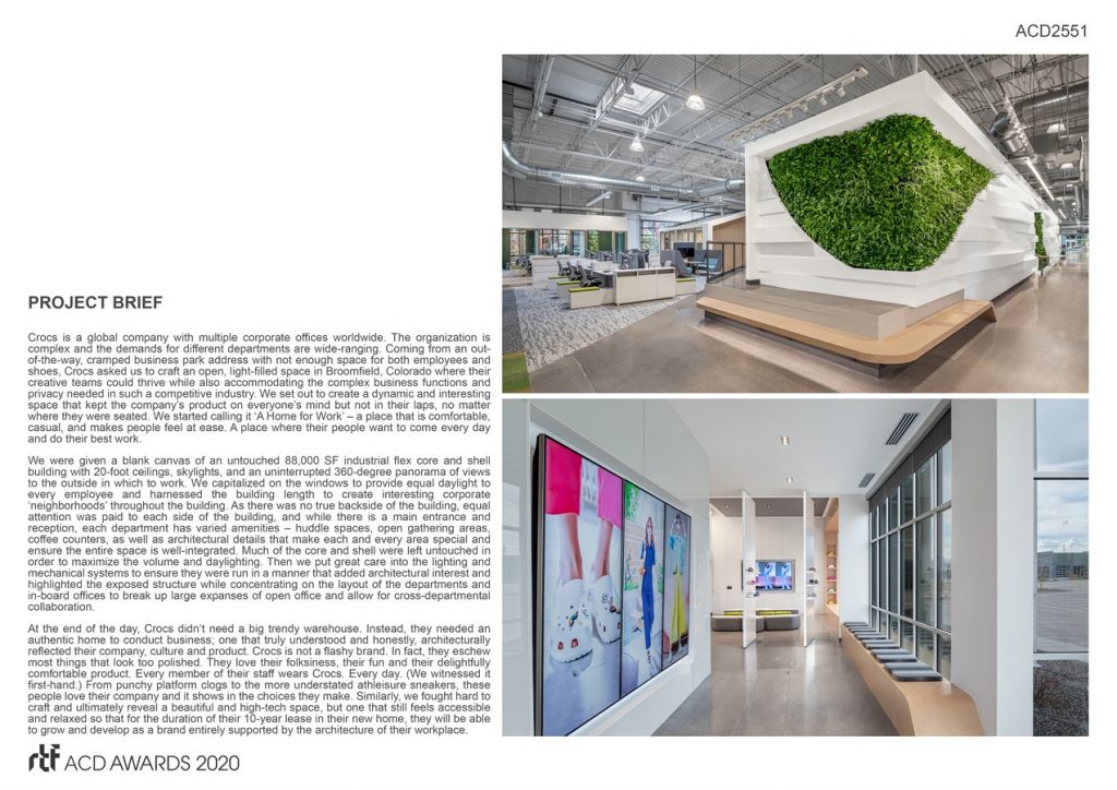
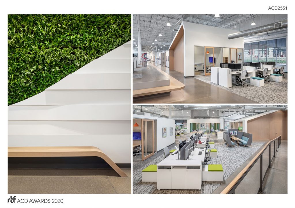
We were given a blank canvas of an untouched 88,000 SF industrial flex core and shell building with 20-foot ceilings, skylights, and an uninterrupted 360-degree panorama of views to the outside in which to work. We capitalized on the windows to provide equal daylight to every employee and harnessed the building length to create interesting corporate ‘neighborhoods’ throughout the building. As there was no true backside of the building, equal attention was paid to each side of the building, and while there is a main entrance and reception, each department has varied amenities – huddle spaces, open gathering areas, coffee counters, as well as architectural details that make each and every area special and ensure the entire space is well-integrated.
©Caleb Tkach
Much of the core and shell were left untouched in order to maximize the volume and daylighting. Then we put great care into the lighting and mechanical systems to ensure they were run in a manner that added architectural interest and highlighted the exposed structure while concentrating on the layout of the departments and in-board offices to break up large expanses of open office and allow for cross-departmental collaboration.
At the end of the day, Crocs didn’t need a big trendy warehouse. Instead, they needed an authentic home to conduct business; one that truly understood and honestly, architecturally reflected their company, culture and product. Crocs is not a flashy brand. In fact, they eschew most things that look too polished. They love their folksiness, their fun and their delightfully comfortable product. Every member of their staff wears Crocs. Every day. (We witnessed it first-hand.)
©Caleb Tkach
From punchy platform clogs to the more understated athleisure sneakers, these people love their company and it shows in the choices they make. Similarly, we fought hard to craft and ultimately reveal a beautiful and high-tech space, but one that still feels accessible and relaxed so that for the duration of their 10-year lease in their new home, they will be able to grow and develop as a brand entirely supported by the architecture of their workplace.
- ©Caleb Tkach
- ©Caleb Tkach
- ©Caleb Tkach
